Conventional wisdom screams that bright white is the only way to expand space. Yet, strict adherence to pale neutrals often creates sterile, boxy environments completely lacking soul.
My own tiny powder room felt claustrophobic until a coat of charcoal navy erased its edges, instantly blurring where the corners began. Deep hues do not shrink footage; they push walls back by absorbing light, creating infinite depth.
Forget safety in beige. Embracing shadows adds drama while tricking eyes into perceiving more room than actually exists.
The Dark Side of Design: Expanding Space with Deep Hues
Challenge the outdated belief that only stark white can enlarge a compact area; often, it simply highlights the strict limitations of the room’s dimensions. Instead, enveloping a small space in rich, dark tones dissolves visual boundaries, effectively making corners disappear into shadow.
This technique creates an optical illusion of boundless depth, turning a cramped area into a sophisticated, expansive sanctuary rather than a sterile box.
The Dark Side
🌫️ Blurring Boundaries
Saturation hides corner definitions, making it hard for the eye to see where walls end.
🕶️ Visual Recession
Deep shades absorb light, causing surfaces to retreat and creating perceived distance.
🌃 Atmospheric Depth
Rich tones eliminate the clinical feel of pale neutrals, injecting instant mystery.
♾️ Infinite Illusion
Embracing shadows tricks perception, creating a limitless void rather than a box.
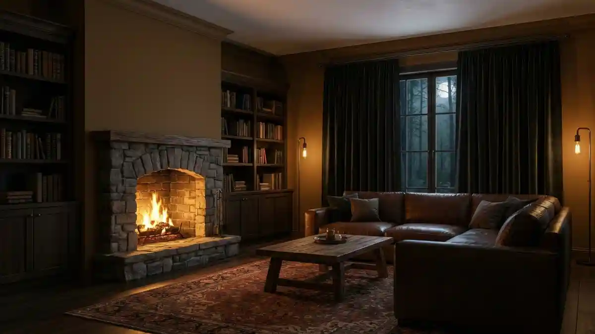
1. Midnight Noir and Chocolate Lounge – Expanding Space Through Shadow
Velvety matte noir walls act as a visual magic trick here, dissolving the sharp corners that usually define a room’s limits.
By absorbing light rather than reflecting it, that back wall seems to push outward, creating a sense of infinite depth rather than confinement.
- Verticality Hacks: Vertical slat paneling introduces a rhythmic texture that instantly tricks the brain into perceiving significantly higher ceilings. Drawing the eye upward elongates the walls, proving that dark colors don’t have to feel heavy or oppressive when structure leads the way. Height makes everything feel grander.
- Metallic Punctuation: Glimmering gold palms and warm lamp pools serve as distinct focal points against the moody backdrop, preventing the darkness from becoming a void. Placing these bright, reflective elements in the corners actually highlights the width of the space, ensuring the layout feels open rather than caved in. Light needs shadow to truly shine.
- Reflective Grounding: High-gloss flooring provides a crucial counterpoint to the matte walls by reflecting every ounce of ambient light. Mirroring the furniture and decor creates a watery, expansive effect right underfoot, effectively doubling the visual volume of the room. Reflections are a small room’s best friend.
2. Enchanted Forest Library
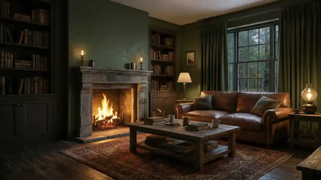
Saturation is the secret weapon here, specifically how the deep, earthy olive wraps every inch of the built-ins and trim in a seamless hug.
By eliminating white contrast lines that usually chop up a room, the eye glides effortlessly across the bookshelves and walls without stopping, creating a unified canvas that feels vastly larger than a standard study.
It is less about painting a room and more about curating an atmosphere that breathes.
- Camouflage Technique: Drenching the cabinetry in the exact same hue as the drywall makes the heavy storage units melt away. Visual clutter is instantly reduced when bulky furniture blends into the architecture, leaving the actual floor plan feeling open and uncluttered.
- Outdoor Continuity: Matching the interior paint to the foliage visible through the window allows the room to borrow visuals from the outdoors. Boundaries dissolve when the garden seems to flow right through the glass, extending the living space all the way to the tree line.
- Warm Contrast: Amber firelight and brass lamps carve out cozy, distinct zones within the deep green expanse without breaking the flow. Dark walls act as a stage, letting these pools of light define the volume of the room while keeping the corners mysterious and undefined.
3. Chocolate Truffle Retreat Bedroom
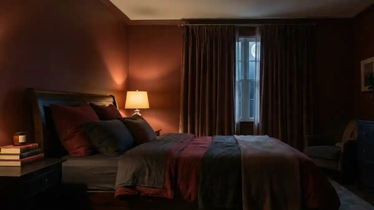
Enveloping walls in a shade of deep cocoa might seem counterintuitive for a limited floor plan, yet it works magic by blurring the structural lines where corners usually define the room’s limits.
Shadows play across the rich surfaces, creating an optical illusion of infinite depth rather than a confined box, especially when paired with floor-to-ceiling drapes that draw the eye upward.
Stepping into this sanctuary feels like a warm hug where physical boundaries simply melt away into the cozy atmosphere.
- Elongated drapes match the wall tone almost perfectly, tricking the eye into seeing higher ceilings and unbroken vertical lines.
- Warm lamp lighting casts soft glows against the dark backdrop, preventing the space from feeling cave-like while adding necessary dimension.
- Layered bedding in slate gray and deep red breaks up the monochrome palette, offering a grounding center without shrinking the perceived floor space.
4. Charcoal Grey Study – Creating Spaciousness through Shadow and Light
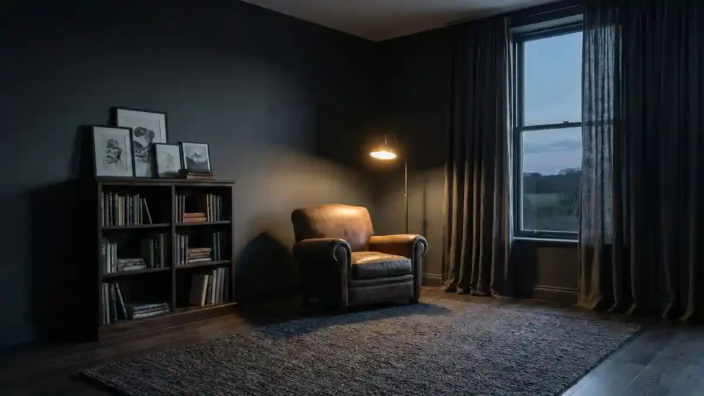
Deep, almost black, charcoal walls in this reading corner demonstrate how dark hues can redefine spatial boundaries.
Instead of closing in, the matte finish absorbs light, causing the corners to lose their definition and the walls to visually recede.
It’s a counter-intuitive effect where the absence of bright light reflection actually makes the room feel deeper and more expansive, like looking into a boundless night sky rather than a painted box.
- Vertical Emphasis: Floor-to-ceiling drapery in a similar dark shade draws the eye upward, emphasizing the room’s height rather than its width. By accentuating the vertical dimension, the space feels grander and less confined by its footprint.
- Illuminated Focus: A single floor lamp casts a warm pool of light on the leather armchair, creating an intimate zone within the larger dark space. This strategic lighting forces the surrounding shadowed areas to fall back, enhancing the feeling of depth.
- Framing the View: Dark walls act as a subtle frame for the window, drawing the eye through the glass to the twilight landscape beyond. By connecting the interior with the outdoors, the perceived boundaries of the room are extended, making it feel larger than it is.
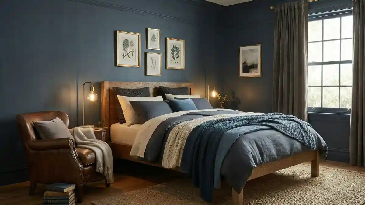
5. Deep Oceanic Navy Bedroom – A Vast Sanctuary for Rest

Drenching walls in this profound navy hue acts differently than black or charcoal; instead of just absorbing light, it creates a receding, calm backdrop akin to the evening sky.
By pushing the visual boundaries backward, the deep blue allows lighter elements to step forward, generating a sense of layered depth rather than a cramped enclosure.
It is about creating a peaceful expanse where the walls seem to drift away, leaving a serene void for relaxation.
- Warm Contrast Layers: Honey-toned oak timber and rich leather furniture leap against the cool backdrop, creating distinct visual planes that prevent the room from feeling flat or compressed.
- Brightness Breaks: Utilizing crisp white mats and reflective gold frames in a gallery layout interrupts the dark expanse, adding necessary pops of brightness that draw the eye across the wall surface.
- Textural Centering: Layering varied textiles like chunky knits, smooth linen, and rough jute in lighter complementary shades builds dimension right in the center of the room, keeping the focus anchored while the dark walls recede into the distance.
6. Almost-Black Ink Study – An Expansive Sanctuary for Thought
Embracing a hue that teeters on the edge of total blackness might seem counterintuitive for gaining space, yet this den proves that shadows can be incredibly liberating.
Instead of defining a rigid box, these deeply saturated walls dissolve into obscurity, especially in low light, effectively erasing the corners where the room ought to end.
It is a theatrical trick where the architecture steps back into the darkness, leaving a boundless stage for quiet contemplation.
- Illuminated Zoning: A solitary warm desk lamp acts as the room’s true architect, carving out an intimate sphere of light around the seating area while forcing everything outside its glow to recede into an undefined distance. Shadows create depth, not walls.
- Sheer Continuity: Dressing the windows in dark, translucent fabric rather than high-contrast white blinds allows the natural light sources to blend softly into the walls rather than chopping up the visual plane. Unbroken lines trick the eye into seeing more width.
- Anchoring Elements: Massive, book-filled shelving units and a sprawling textured rug provide necessary gravity, ensuring the inhabitants feel grounded even while the surrounding dark walls seem to float away. Structure prevents the void from feeling overwhelming.
7. Petrol Blue Twilight Living Room
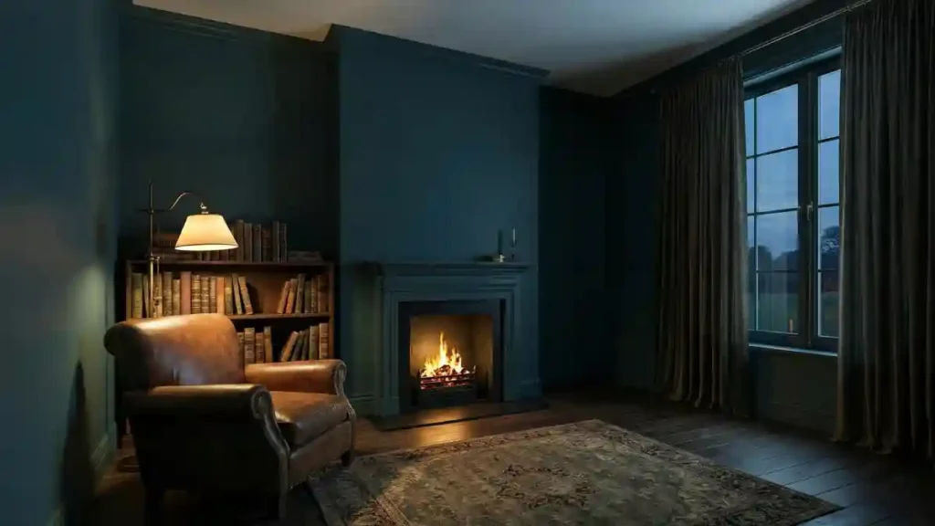
Saturating a room in deep teal—including the fireplace mantel and crown molding—does more than just look moody;
it physically alters the perception of volume. Cool colors naturally recede away from the eye, and when applied continuously without contrasting white trim, they effectively dissolve the room’s edges.
Instead of sitting in a confined box, the space feels like an open, aquatic expanse where the walls step back to let the inhabitants breathe.
- Architectural Camouflage: Paint the fireplace surround and baseboards in the exact same shade as the drywall to reduce visual noise; minimizing breaks in the color field tricks the brain into seeing a larger, uninterrupted surface area.
- Center Stage Warmth: Let the roaring fire and leather armchair serve as the only anchors in the room, pulling focus to the middle while the cool, dark walls drift away into the shadows.
- Textural Continuity: Hang heavy drapes in a matching tone to mask the window frames, creating a soft, vertical pillar of color that adds height and prevents the room from feeling chopped up by hard lines.
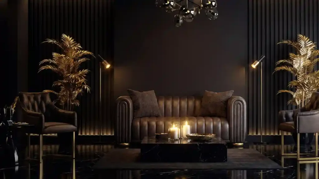
8 Electric Cobalt Gaming Lair
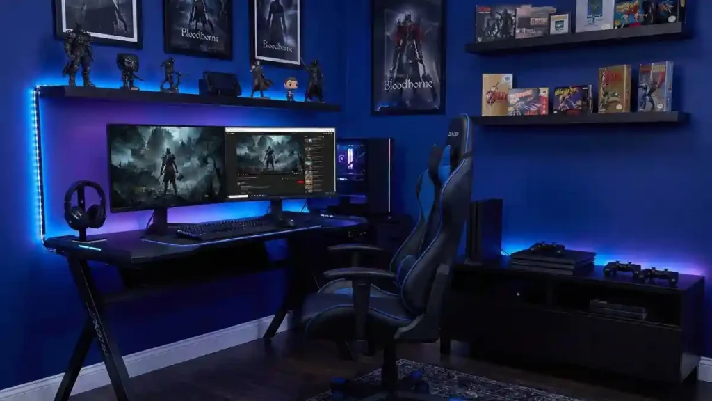
Saturated electric indigo paint transforms a standard spare room into an immersive command center that feels boundary-less.
Dark walls in a gaming setup serve a dual purpose: they eliminate screen glare and, more importantly, dissolve the corners of the room into the shadows, making the physical walls seem to disappear behind the glow of the monitors.
Creating a vacuum of space allows the focus to remain entirely on the digital world, not the drywall box enclosing it.
- Neon Depth Perception: Strategic LED strip lighting placed behind the desk and shelves doesn’t just look cool; it pushes the dark wall away visually. Backlighting creates a separation between the furniture and the paint, generating a 3D effect that makes the room feel significantly deeper.
- Tech Camouflage: Black consoles, monitors, and shelving units blend seamlessly into the deep blue backdrop, reducing visual weight. Integrating the tech into the wall color prevents the setup from feeling cluttered, keeping the space feeling open and streamlined.
- Immersive Zoning: Vibrant blue walls enhance the gaming experience by lowering ambient light contrast, allowing the eyes to rest easy on the screens while the rest of the room fades into a cool, expansive void.
9. Expanding a Cozy Den with Deep Color
Forget everything you’ve heard about dark colors shrinking a room; this den proves that wrapping walls in a deep, warm espresso hue actually pushes the boundaries outward. Instead of feeling closed in, the space feels expansively cozy, like a grand library at night.
The secret lies in how the rich paint color blurs the harsh lines of the corners, allowing the warm glow of the fire and the Edison lamps to pop, creating layers of visual depth that make the back walls recede.
- Floor-to-ceiling drapes that perfectly match the wall color perform a vanishing act on the room’s edges, tricking the eye into seeing endless space instead of a definitive corner.
- Strategic pools of warm light from the Edison bulbs and the roaring fireplace carve out distinct zones within the darkness, adding incredible visual depth that makes the back wall feel further away.
- Tall, built-in bookshelves and that massive stone chimney breast force your gaze upward toward the ceiling, emphasizing vertical volume and stopping the dark paint from feeling oppressive.
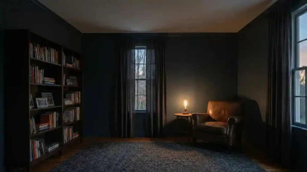
10. Mauve Study Sanctuary
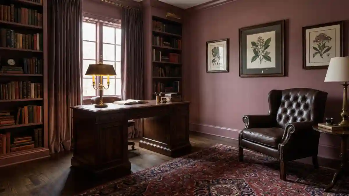
Drenching a room in a single, sophisticated hue like this dusty mauve is a brilliant strategy for visual deception.
By coating everything—walls, trim, and even those massive built-in bookshelves—in the same soft color, you effectively erase the visual cues that typically define a room’s corners and edges.
Instead of feeling boxed in by carpentry, the eye glides effortlessly across the surfaces, perceiving a continuous, enveloping space that feels far more generous than its actual footprint suggests.
- Curtain Call: Hanging floor-to-ceiling drapery in the exact same fabric tone as the paint allows the window area to blend seamlessly into the surrounding wall, creating a sense of uninterrupted verticality.
- Grounding Forces: Substantial pieces like the dark timber desk and tufted leather armchair act as necessary visual weights in the center of the room, allowing the lighter, monochromatic walls to visually float away.
- Luminous Layers: Warm pools of light from the lamps and the rich, patterned rug underfoot introduce essential depth and texture, preventing the single-color expanse from ever feeling flat or dull.
11. Rich Berry Living Space – Wrapping Your Room in Expansive Warmth
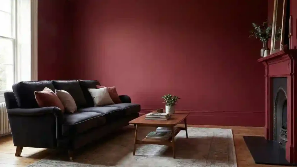
Embrace the unexpected power of a rich burgundy hue to actually open up a room, rather than closing it in.
Coating the walls in such a deep, saturated color creates an intimate atmosphere that simultaneously tricks the eye by blurring the harsh lines of the corners.
It’s a cozy embrace that feels boundless because your vision isn’t immediately stopped by stark white boundaries, allowing the walls to visually recede into a warm depth.
- Seamless Architecture: Painting the fireplace mantel in the exact same shade as the walls removes a major visual break, allowing the eye to travel uninterrupted across the entire surface and perceive a wider expanse.
- Luminous Escape: A large window with bright natural light acts as a crucial counterpoint, providing a brilliant contrast that stops the deep red from feeling oppressive and highlights the room’s actual volume.
- Neutral Anchors: Utilizing a large, light-colored area rug and pale throw pillows grounds the space and provides necessary brightness in the center, preventing the rich wall color from feeling like a bottomless pit.
12. Regal Plum and Porcelain Bathroom
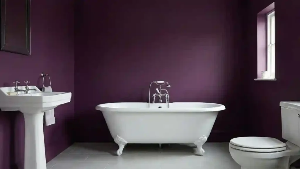
Choosing a daring, saturated plum for a bathroom might feel risky, but the payoff here is undeniable.
Instead of shrinking the room, this deep violet hue pushes the walls outward, creating a dramatic backdrop that makes the pristine white porcelain fixtures pop with incredible brightness.
It transforms a utilitarian space into a luxurious sanctuary where the color does the heavy lifting, turning a standard layout into something that feels grand and expansive.
- High-Contrast Pop: Crisp white ceramics, like the clawfoot tub and pedestal sink, act as bright visual anchors that break up the deep color field. Sharp bursts of brightness prevent the room from feeling heavy, guiding the eye around the space and emphasizing the open layout.
- Natural Illumination: Sunlight streaming through the small window interacts beautifully with the matte finish of the purple walls. Rather than reflecting harsh glare, the walls absorb the glow, softening the overall ambiance and adding a layer of sophisticated depth that lighter hues often lack.
- Minimalist Clarity: Avoiding unnecessary clutter allows the bold wall color to breathe without competition. Sticking to essential fixtures ensures the deep plum hue becomes the star of the show, creating a streamlined look that feels uncluttered and surprisingly airy.
13. A Monochromatic Living Room that Breathes

Color drenching is the ultimate spatial trick here; by coating the walls, skirting boards, mantel, and even that closet door in the same matte charcoal, visual clutter completely vanishes.
Instead of chopping up the wall with traditional white trim, the eye glides across the surface uninterrupted, creating an illusion of infinite height and width.
It transforms a potentially boxy corner into a sophisticated, airy backdrop where the rich textures of the decor take center stage rather than the room’s physical limits.
- Camouflaging the door and architectural millwork in that matching deep grey erases the usual visual boundaries, effectively tricking your brain into perceiving a seamless, larger open space.
- Warm, honey-toned wood floors and the vintage bookshelf act as grounding elements, popping against the dark void to provide scale without breaking the room’s expansive flow.
- Strategically placed greenery on the mantel breathes life into the shadowy palette, adding organic shapes that soften the corners and prevent the monochromatic scheme from feeling flat.