
Hallways frequently act as overlooked dumping grounds. Traversing gloomy, cramped paths ruins interior ambiance. My entryway stayed empty for ages because locating narrow consoles seemed daunting. Lost potential hurts home value. Such transition zones demand revitalization. Why settle for boring drywall? Clever decor alters perception, pushing walls outward with visual tricks. Strategic mirrors, bold runners, and focused sconces bring life to dormant areas. Every step should offer visual intrigue rather than just connecting bedrooms. Transforming tight spots creates surprising elegance. Guests deserve a grand welcome, not a squeeze. Reclaim lost space. Make every foot meaningful.
Turning Cramped Hallways into Stylish Transition Zones
Transition areas often suffer from neglect, becoming dark passages rather than inviting features. Employing smart design elements like reflective surfaces and elongated rugs, you can visually expand these tight corridors. Treat these pathways as opportunities to set the tone for your home, ensuring every square inch serves a purpose beyond mere connectivity.
Stylish Transition Zones
Reflective Depth
Install large mirrors to bounce light and create an immediate illusion of space.
Directional Textiles
Lay down long, patterned runners to guide the eye and add warmth to floors.
Vertical Illumination
Mount sleek wall sconces to banish shadows without consuming floor space.
Slim Functionality
Utilize ultra-narrow console tables for keys or decor without obstructing flow.
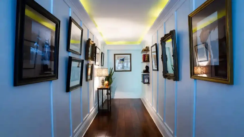
1. Elevating Vertical Space with Paneling
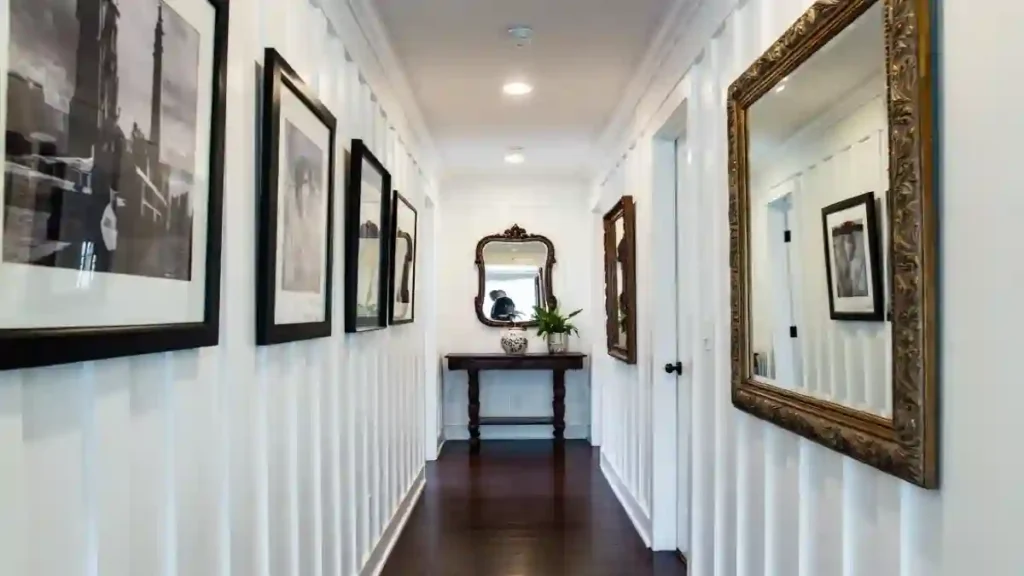
Vertical board and batten paneling instantly adds architectural character, forcing the gaze upward and making the ceiling feel loftier than it actually is.
High-contrast black frames against white walls create a sophisticated rhythm, turning a simple walk from room to room into a curated experience. \
Large, gilded mirrors placed opposite the art not only check your look but also aggressively expand the visual field by reflecting the gallery wall, creating depth where there was none.
- Vertical lines elongate walls for a grander feel.
- Reflective decor effectively doubles the visual width.
- Console tables at the end provide a necessary focal point.
2. Classic Pinstripe and Floral Cottage Hallway
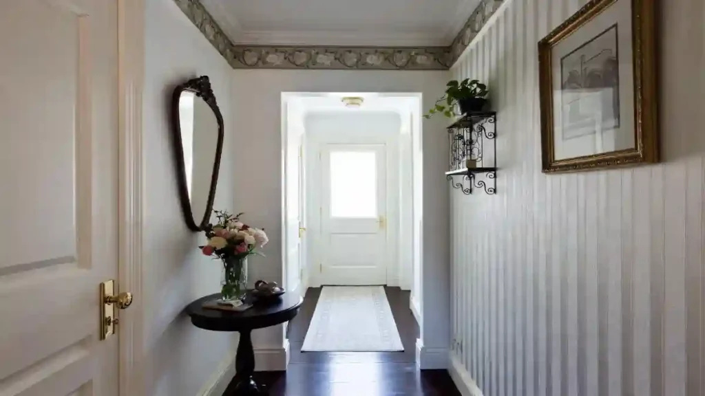
Vertical pinstripes work magic in tight corridors by drawing the eye up, making low ceilings feel instantly higher while keeping the walls bright and airy.
Adding a floral border creates a charming vintage cap that softens the rigid lines without overwhelming the narrow width, proving you can mix patterns even in confined areas.
A demilune (half-moon) table hugs the wall tightly, offering a surface for fresh blooms and keys without creating a hip-bruising corner.
- Curved furniture edges prevent obstruction in high-traffic zones.
- Subtle vertical patterns create an optical illusion of height.
- Light runners brighten dark flooring while directing foot traffic.
3. Modern Illumination and Reflection Hallway
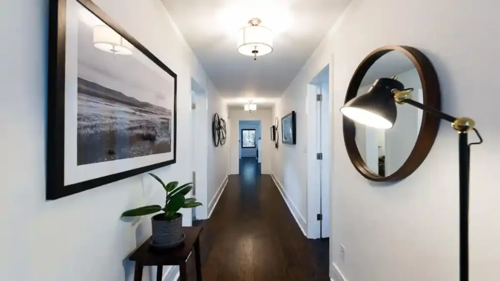
Long, interior corridors often suffer from a cave-like atmosphere, but strategic, layered lighting transforms them completely.
Overhead drum fixtures provide essential ambient light, while a sleek floor lamp placed directly in front of a large, round mirror creates a brilliant, unexpected focal point.
The mirror acts as a secondary light source, reflecting the lamp’s glow and the opposite artwork to visually expand the width and break up the monotonous linear path.
- Combining ceiling fixtures with floor lamps eliminates shadowy corners.
- Round mirrors soften the harsh, straight lines typical of narrow hallways.
- Oversized artwork adds significant visual interest without taking up floor space.
4. Eclectic Collector’s Gallery Hallway
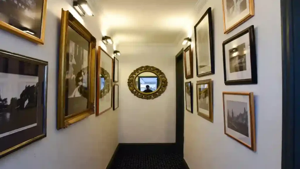
Transforming a narrow corridor into a personal museum, this approach uses every available inch of wall space to create a dense, captivating gallery.
A mix of ornate gold and sleek black frames in varying sizes creates a dynamic visual rhythm that distracts from the hallway’s tight dimensions.
Wall sconces placed above the artwork cast a warm, focused glow, highlighting the textures and details of each piece while adding a layer of sophistication that overhead lights alone can’t achieve.
- Filling walls from floor to ceiling with art creates an immersive experience.
- Mixing frame styles and sizes adds eclectic charm and visual depth.
- Directed wall sconce lighting brilliantly showcases individual artworks.
5. Wrapping Walls in Sophistication
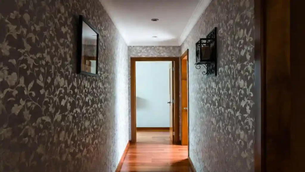
Enveloping a narrow corridor in bold, edge-to-edge wallpaper creates an immediate “jewel box” effect that feels intentionally cozy rather than claustrophobic.
Intricate leafy patterns in muted taupe and grey tones blur the sharp corners of the walls, tricking the eye into focusing on the rich texture rather than the limited width.
Small, stark black accents—like the geometric sconce and slim frame—punctuate the busy backdrop, offering a necessary visual anchor without breaking the immersive, moody atmosphere.
- Continuous patterns disguise tight boundaries by drawing the eye continuously around the space.
- Warm wood flooring contrasts beautifully with cool-toned wallpaper for balance.
- Sparse, high-contrast accessories prevent the design from feeling cluttered.
6. Spanish-Inspired Tile Corridor
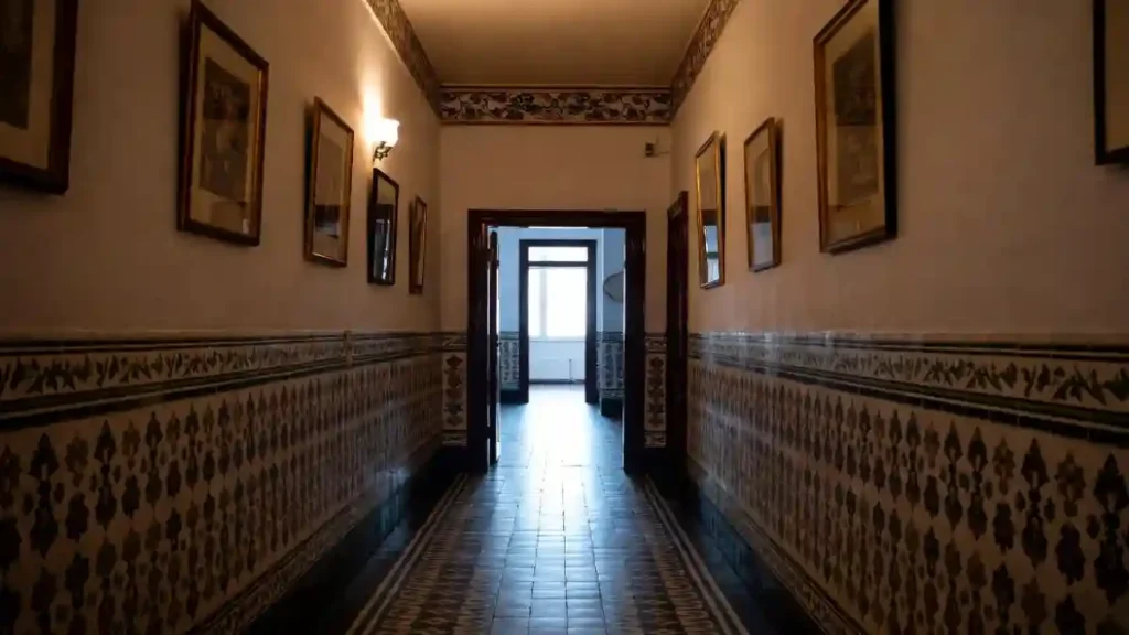
Distinctive patterned tile wainscoting anchors the lower half of these walls, offering a rugged yet artistic barrier against scuffs while grounding the airy white space above.
Coordinating floor tiles feature a built-in runner design, guiding guests forward with a geometric rhythm that eliminates the need for fabric rugs that might slip or stain.
High up, a matching decorative border mirrors the lower details, sandwiching the gallery of framed prints in a cohesive, deliberate layer of pattern.
- Ceramic wainscoting provides a scratch-resistant surface ideal for busy passageways.
- Inlaid floor patterns mimic the look of a runner without the tripping hazard.
- Repeating motifs near the ceiling create a balanced vertical frame for artwork.
7. Sculptural Relief and Geometric Contrast
Texture becomes the hero in this monochromatic space, where 3D wall panels replace standard paint to create a tactile, shifting surface that plays with light and shadow.
Heavy, organic relief patterns on the walls act as built-in art, eliminating the need for protruding frames that might clutter a tight walkway.
Sharp, dark wood door casings provide a necessary, rigid frame for the flowing wall textures, while the diamond-patterned flooring grounds the airy aesthetic with geometric precision.
- Three-dimensional wall coverings hide imperfections and dampen sound.
- Dark wood trim creates a bold, outlining effect against white relief.
- Geometric floor patterns offer a rigid counterpoint to organic wall motifs.
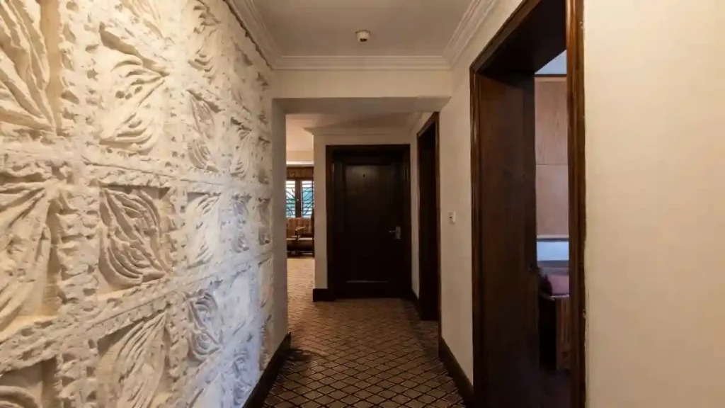
8. Merging History with Modern Flow
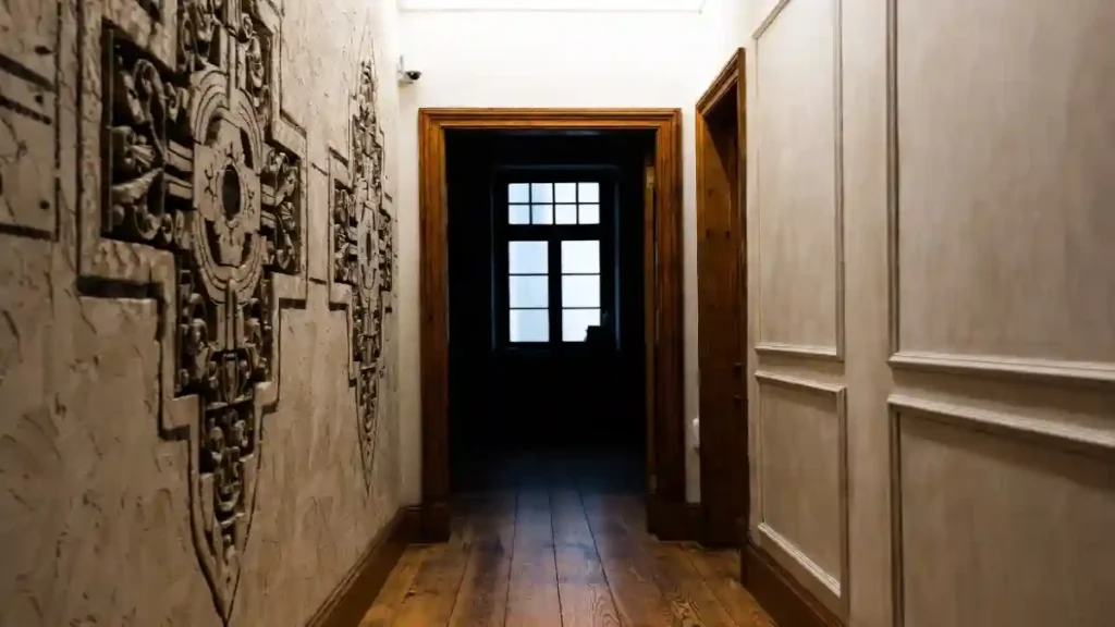
Oversized relief carvings dominate the wall, instantly giving this narrow corridor the gravitas of a historic manor without requiring actual square footage.
Balancing such heavy, ornate texture with clean, neutral paneling on the opposite side prevents the space from feeling claustrophobic or overly dark.
Wide-plank timber flooring adds a rustic warmth that grounds the grand architectural elements, leading the eye naturally toward the window’s natural light.
- Large-scale architectural reliefs replace traditional gallery walls for a cleaner look.
- Asymmetrical wall treatments create visual interest without overwhelming the width.
- Running floorboards lengthwise visually stretches the hallway toward the light source.
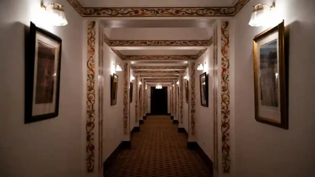
9. Royal Rajasthani Fresco Hallway
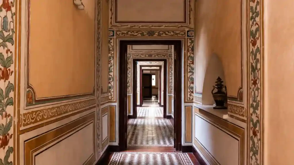
Intricate, hand-painted floral borders trace the edges of every doorway and panel, transforming plain walls into a storytelling canvas reminiscent of a historic haveli.
Warm peach tones wash the corridor in a sunset-like glow, softening the rigid sequence of dark wooden frames that lead the eye deep into the home’s interior.
An arched wall niche acts as a built-in focal point, perfectly cradling an antique vase to add three-dimensional interest without stealing an inch of floor space.
- Painted floral creepers frame architectural lines to celebrate verticality.
- Geometric floor tiles anchor the warm walls with a cool, rhythmic pattern.
- Recessed alcoves provide sophisticated storage for artifacts in tight spots.
11. Regal Teal and Gold Gallery Hall
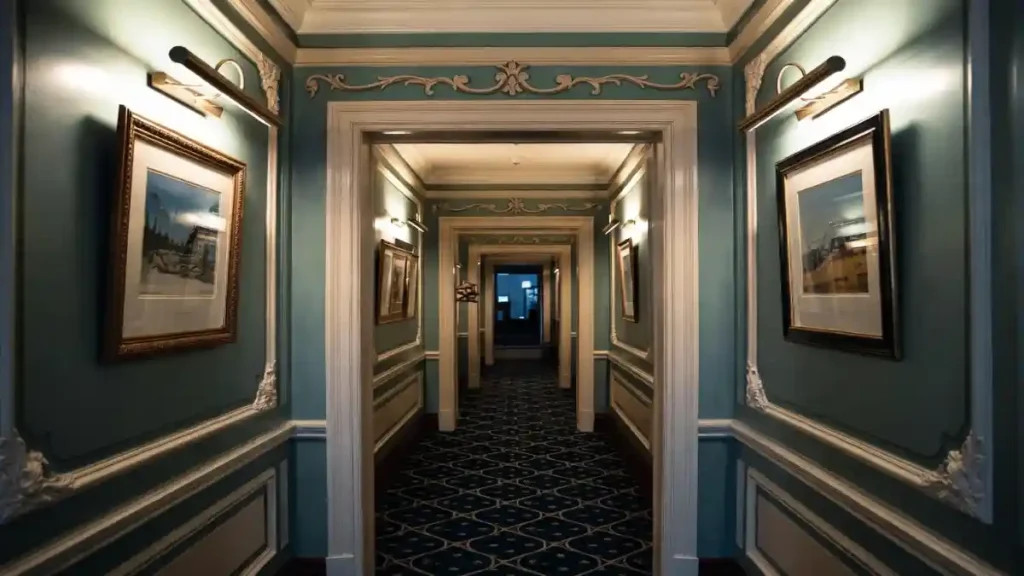
Deep teal paint paired with crisp white wainscoting instantly gives a narrow passage depth and character, preventing the walls from feeling like they are closing in.
Mounting brass picture lights above framed artwork draws the eye upward and creates intimate pockets of illumination, treating the thoroughfare less like a tunnel and more like a curated exhibition.
Treating the ceiling and trim with elaborate detailing adds a layer of sophistication often reserved for main living areas.
- Install hardwired art sconces above frames to provide ambient lighting that highlights your decor rather than just flooding the floor.
- Utilize intricate moldings or chair rails to break up vertical wall space, making the hallway feel wider and more structured.
- Select a continuous patterned runner or carpet in a coordinating deep hue to visually lengthen the floor plan while adding texture.
12. Modern Batten and Halo Light Hallway
Vertical board and batten paneling stretches the visual height of a cramped corridor, making low ceilings feel instantly airier while adding architectural weight.
Recessed cove lighting tucked into the crown molding casts a warm, ethereal glow that eliminates the need for bulky overhead fixtures which often clutter narrow paths.
Mixing framed art with practical elements like floating bookshelves transforms the transit area into a functional library and display space rather than just a blank pass-through.
- Tuck warm LED strips behind molding to create a perimeter glow that expands the spatial perception of the ceiling without occupying physical headroom.
- Use vertical wood detailing to add architectural interest that directs the gaze upward rather than focusing on the narrow width between walls.
- Anchor the end of the walkway with a slim console table and greenery to provide a visual landing spot that invites you forward through the home.
13. Doubling Depth with Reflective Grandeur
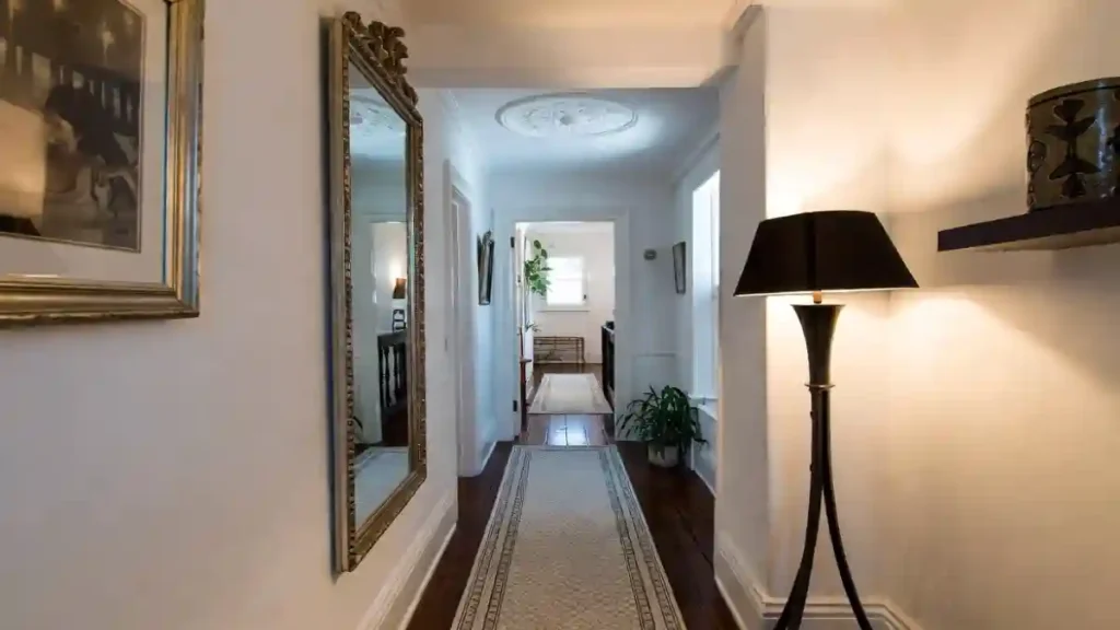
Crisp white walls paired with dark hardwood flooring create a high-contrast canvas that feels clean and expansive, but the real secret to unlocking space here lies in the oversized, ornate mirror.
Placing a reflective surface of this magnitude on a side wall effectively punches a “hole” in the boundary, visually doubling the hallway’s width and bouncing natural light from adjacent rooms into the corridor.
Incorporating a sculptural floor lamp and a ceiling medallion introduces artistic curves that soften the rigid straight lines typical of narrow passages.
- Lean or mount a grand, gilded mirror to trick the eye into perceiving a second room where there is only a wall.
- Install a ceiling medallion to highlight architectural character and draw attention to the vertical volume of the space.
- Choose a tall, slender floor lamp with a distinct silhouette to add ambient lighting without requiring complex electrical work.
14. Curating a Floor-to-Ceiling Art Experience
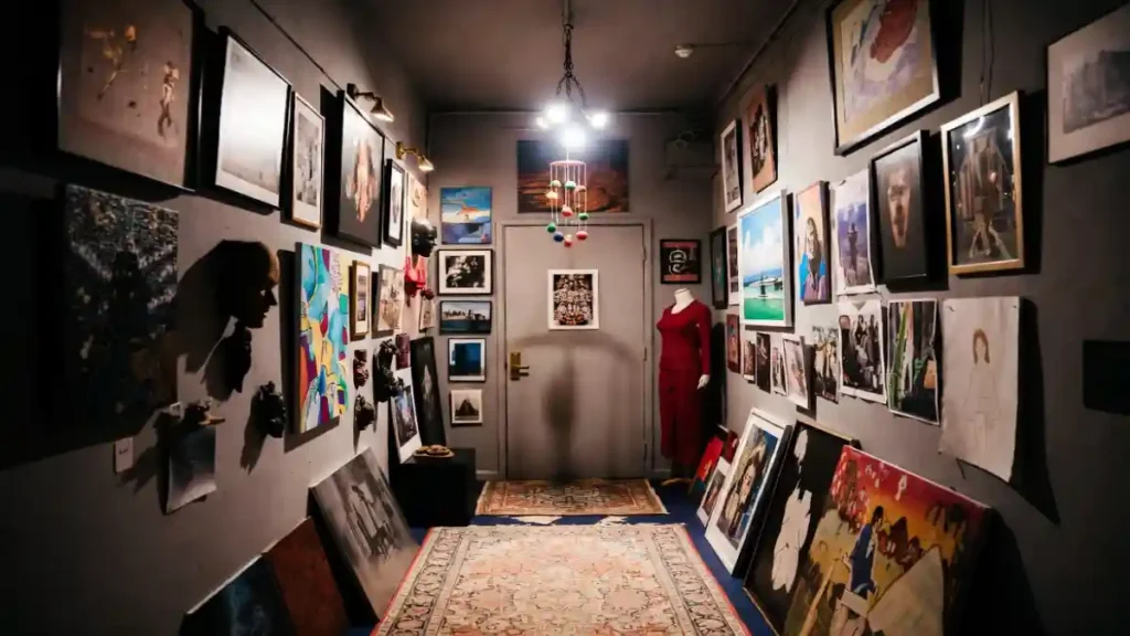
Stormy grey walls provide the perfect moody backdrop for a maximalist art collection that refuses to stay within the lines, spilling energetically from the ceiling down to the floor.
Hanging art salon-style creates a dense, rich tapestry of visual interest that makes the narrowness of the hall feel intentional and cozy rather than cramping.
Mixing framed pieces with 3D elements—like masks, hanging mobiles, and even a dress form—turns the corridor into a private museum where every inch tells a fascinating story.
- Paint walls a dark matte grey or charcoal to make colorful artwork pop and recede the walls visually.
- Hang artwork floor-to-ceiling and even lean larger frames against the baseboards to create a casual, “artist’s studio” vibe.
- Include unexpected 3D objects or sculptures to break up the flatness of a photo wall and add tactile variety.
15. Converting Utility Halls into Immersive Art Walks
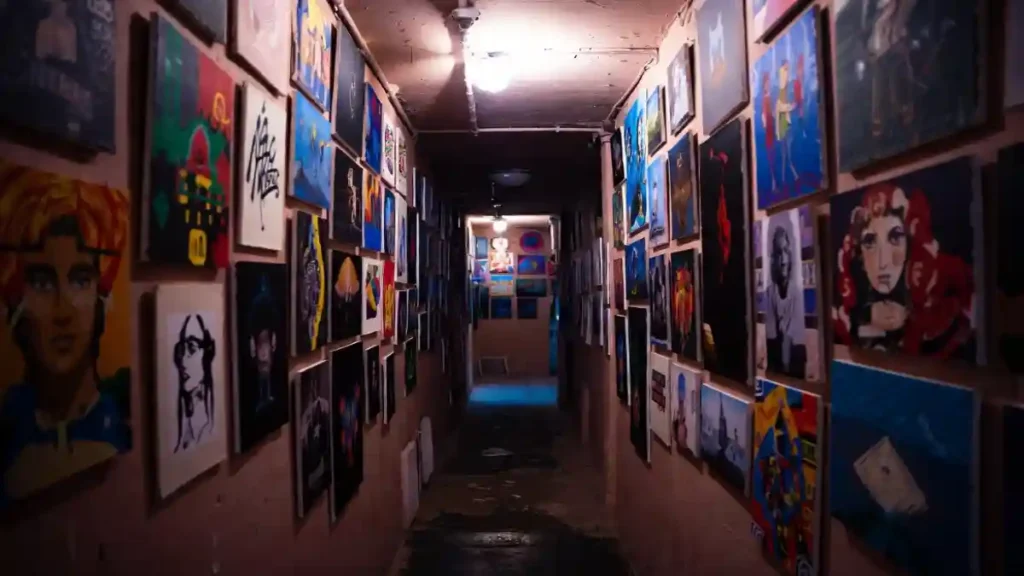
Exposed ceiling pipes and raw conduit don’t have to be hidden; here, they contribute to a gritty, underground aesthetic that pairs perfectly with a floor-to-ceiling art takeover.
Saturating the narrow corridor with a warm, earthy wall color creates a cozy, enclosed feeling, while the dense collage of frameless canvases turns the walk into a private exhibition.
This approach proves that even the tightest, most utilitarian basement passages can become a high-energy focal point by embracing the clutter rather than fighting it.
- Skip the Frames for a Sleek Profile. Mounting canvases directly to the wall saves precious inches in tight spaces and creates a seamless, mural-like effect that feels modern and edgy.
- Embrace the “Tunnel” Effect with Color. Painting walls and ceilings in similar warm, dusty tones blurs the harsh edges of the room, making the space feel like a deliberate cocoon rather than a cramped hallway.
- Utilize Grid Spacing to Tame the Chaos. Aligning the artwork in rough columns or rows provides a subconscious sense of order, preventing the maximalist display from looking like accidental clutter.
16. Creating a High-End Museum Experience at Home
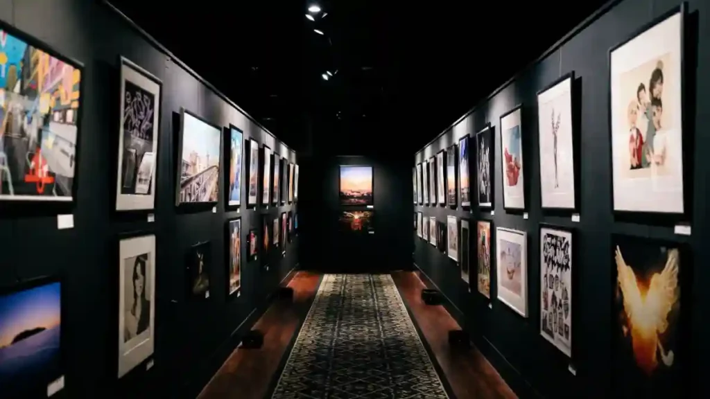
Enveloping a narrow corridor in matte black paint instantly dissolves the corners and boundaries, creating an infinite backdrop that allows colorful artwork to pop with gallery-level intensity.
Directional track lighting is the hero here, casting precise pools of light on the frames while leaving the rest of the space in dramatic shadow, effectively turning a transit area into a destination.
A long, patterned runner rug softens the acoustics and provides a visual path, ensuring the space feels curated rather than just cavernous.
- Install adjustable track lighting to direct high-contrast beams onto your artwork, mimicking the focused atmosphere of a professional exhibition.
- Commit to a monochromatic dark envelope by painting walls and ceilings the same deep shade to eliminate visual clutter and emphasize the art.
- Align frames in a strict linear formation to establish a rhythm that guides the eye forward and complements the architectural lines of the hallway.
17. Layering History in a Narrow Pass
Saturating the walls in a moody sage green creates a cozy, envel. Scattering multiple vintage rugs adds a relaxed, collected vibe that disrupts the hallway’s length and softens the acoustics.
A dense, floor-to-ceiling art display with mixed frames draws the eye to the walls, effectively widening the perception of the space through visual complexity.
- Apply a deep, matte green paint to blur the corners and make the space feel intentionally intimate.
- Use a sequence of mismatched oriental rugs to introduce pattern and break up the linearity of the floor.
- Curate a “salon-style” art wall that mixes eras and mediums to give the hallway a lived-in, historic character.
18. Frescoed Archway Promenade
Elaborate floral scrollwork climbing up the pilasters and across the ceiling beams transforms a plain tunnel into a grand promenade, proving that paint can mimic the weight of real architecture.
Rhythmic placement of warm wall sconces emphasizes this structural repetition, drawing the eye down the corridor in a mesmerizing, almost hypnotic procession.
White walls keep the intricate detailing from feeling too heavy, allowing the gold, terracotta, and olive tones of the motifs to act as the primary decor, eliminating the need for bulky furniture.
- Stencil or hand-paint faux architectural details, such as columns or arches, to add regal grandeur without the dusty mess and cost of actual remodeling.
- Install identical sconces at regular intervals to create a strong visual rhythm that celebrates the hallway’s length rather than trying to disguise it.
- Select a small-scale geometric patterned floor to ground the space with texture that complements the organic curves of the wall art without competing for attention.
19. Framing Depth with Repetitive Architecture
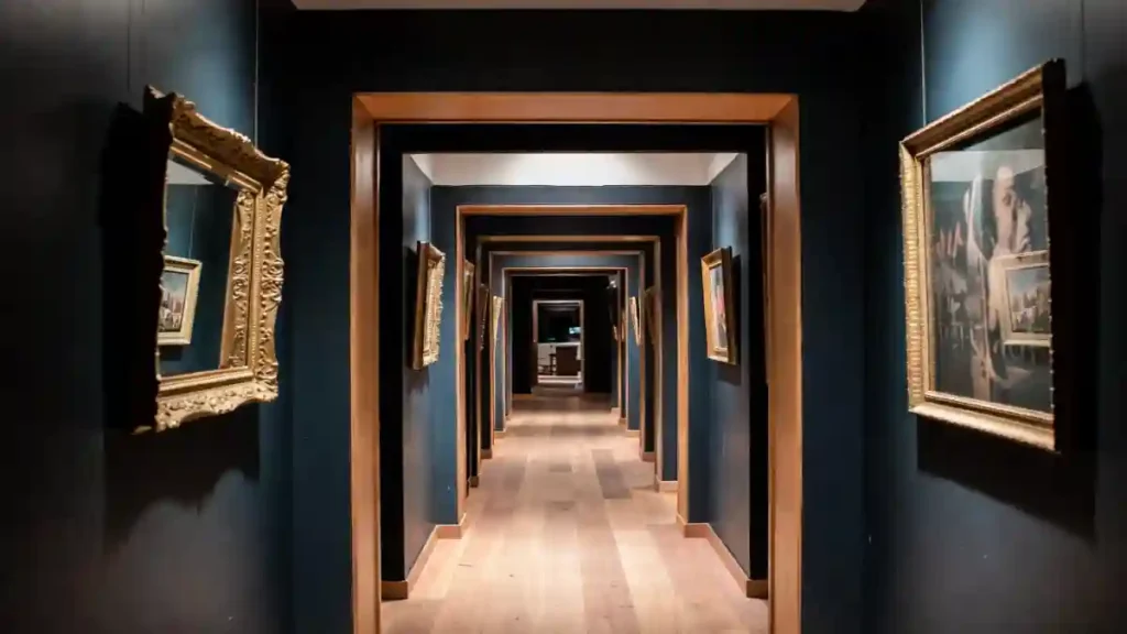
Deep navy paint contrasts sharply with the raw honey-toned wood of the repetitive door frames, creating a mesmerizing “hall of mirrors” effect that draws the viewer deep into the home.
Rhythmic progression of square archways turns a potentially monotonous, windowless corridor into a dramatic architectural journey, celebrating the length of the space rather than hiding it.
Hanging ornate gold-framed art on the dark piers between arches adds a touch of classic luxury that pops against the moody backdrop, proving that dark colors can actually make a narrow space feel grander, not smaller.
- Paint walls a dark, receding color like midnight blue or charcoal to blur the side boundaries and force the eye to focus on the illuminated path ahead.
- Utilize the “enfilade” technique (aligning doorways perfectly) to create a sense of infinite depth and majestic procession, even in a standard floor plan.
- Select high-contrast metallic frames to break up the dark wall expanses and catch the light, adding a layer of shimmer to the shadowy envelope.
20. Structural Warmth Gallery
Introducing a floor-to-ceiling wooden lattice screen serves as a stunning architectural feature that defines the corridor while maintaining a sense of airiness and light flow between rooms.
Crisp white walls provide the perfect gallery space for a cohesive set of black-and-white landscape photos, ensuring the decor feels curated and intentional rather than cluttered.
Warm sconce lighting softens the sharp geometric lines of the grid and frames, creating a welcoming, serene path through the home.
- Use architectural screens to replace solid walls, allowing you to borrow light from adjoining rooms while adding rich wood texture to the passageway.
- Create a grid layout for your artwork that mimics the vertical and horizontal lines of the room divider, establishing a satisfying visual harmony.
- Anchor the corner with a compact wooden cabinet and a single sculptural piece to give the eye a resting place at the end of the hall.
21. Evoking a Night Walk Indoors
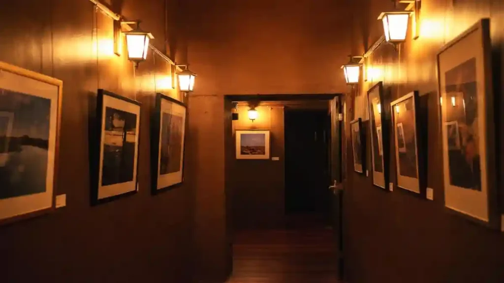
Lantern-style sconces mounted high on chocolate-colored walls create an atmosphere reminiscent of a quiet evening stroll down a historic European alley.
Rather than fighting the shadows with blinding overhead LEDs, this design leans into the darkness, using soft, golden pools of light to illuminate a curated photography collection.
Transforming a transitional space into a moody, immersive experience encourages people to slow down and admire the artwork instead of just rushing through to the next room.
- Install outdoor-inspired lantern sconces to introduce a rustic, architectural element that feels unexpected and charmingly nostalgic indoors.
- Paint the walls in a rich, dark hue like espresso or bronze to amplify the cozy, enveloping effect of the warm lighting.
- Position artwork directly under light sources to create dramatic focal points that guide the viewer down the hall while keeping the rest of the space distinctively moody.