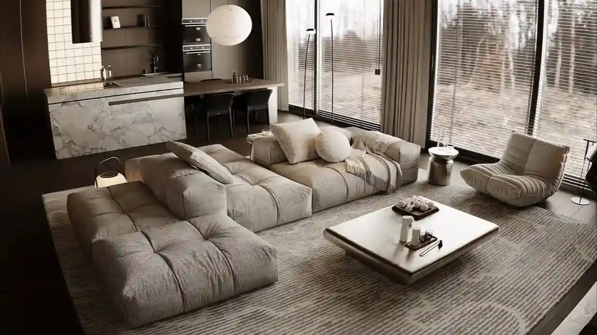
Coffee tables often turn into clutter magnets rather than design centerpieces. Honestly, I have stared at my own messy living room setup, frustrated that it lacked a high-end polish.
Decorating can feel intimidating or simply too expensive. Yet, expensive taste does not require a heavy wallet.
True styling relies on balance, texture, and creativity, not price tags. You want a home that feels curated and cozy. We gathered clever methods to make your space look upscale on a strict budget.
Achieving a High-End Coffee Table Aesthetic on a Budget
Living room surfaces frequently evolve into chaotic catch-alls instead of the chic focal points we envision.
While creating a luxurious atmosphere might feel financially out of reach, true elegance actually comes from intentional composition rather than expensive purchases.
True elegance comes from the thoughtful layering of textures and proportions, proving that a high-end aesthetic relies on creativity rather than a massive budget.
High-End Coffee Table
Implement the Rule of Three
Group odd-numbered items together to create visual interest and prevent static arrangements.
Layer Diverse Textures
Combine contrasting materials (smooth glass, rough ceramics) to add depth and richness.
Utilize a Decorative Tray
Anchor your vignette and corral smaller objects to provide structure and reduce mess.
Incorporate Natural Elements
Distinctive organic touches, like fresh greenery or wood, bring life and warmth to the setup.
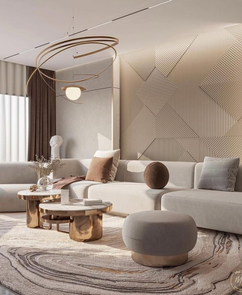
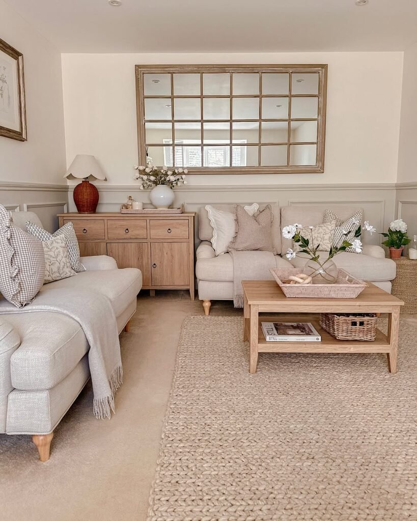
1. Soft Blush and Gold Glass Retreat
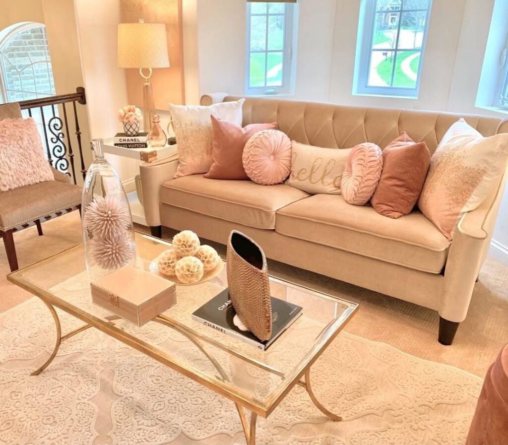
Clear glass tables are brilliant for keeping a small room feeling spacious, but honestly, styling them without creating a cluttered look is a real challenge.
I often hesitate with glass because every fingerprint shows, and there’s nowhere to hide a stray remote.
You might think you need expensive crystal to make it work, yet simply echoing the room’s color palette does the trick.
Repeating the soft pinks from the sofa onto the table connects the whole look, proving that intentional coordination replaces the need for pricey centerpieces.
- Anchor with books: Transparency needs grounding. Placing a solid coffee table book beneath the decor acts as a visual foundation, giving the eye a place to rest so the accessories don’t feel like they are floating in mid-air.
- Repeat soft textures: Cohesion is the secret weapon here. Mimicking the velvet texture of the throw pillows with matte orbs on the table creates a rhythm that makes the affordable decor look like part of a custom collection.
- Add vertical intrigue: Flat layouts can look boring. Including a tall, clear vase draws the eye upward and adds elegance, ensuring the styling feels dynamic and complete without blocking the view of the beautiful rug underneath.
2. Vintage Grey and Floral Cottage Charm
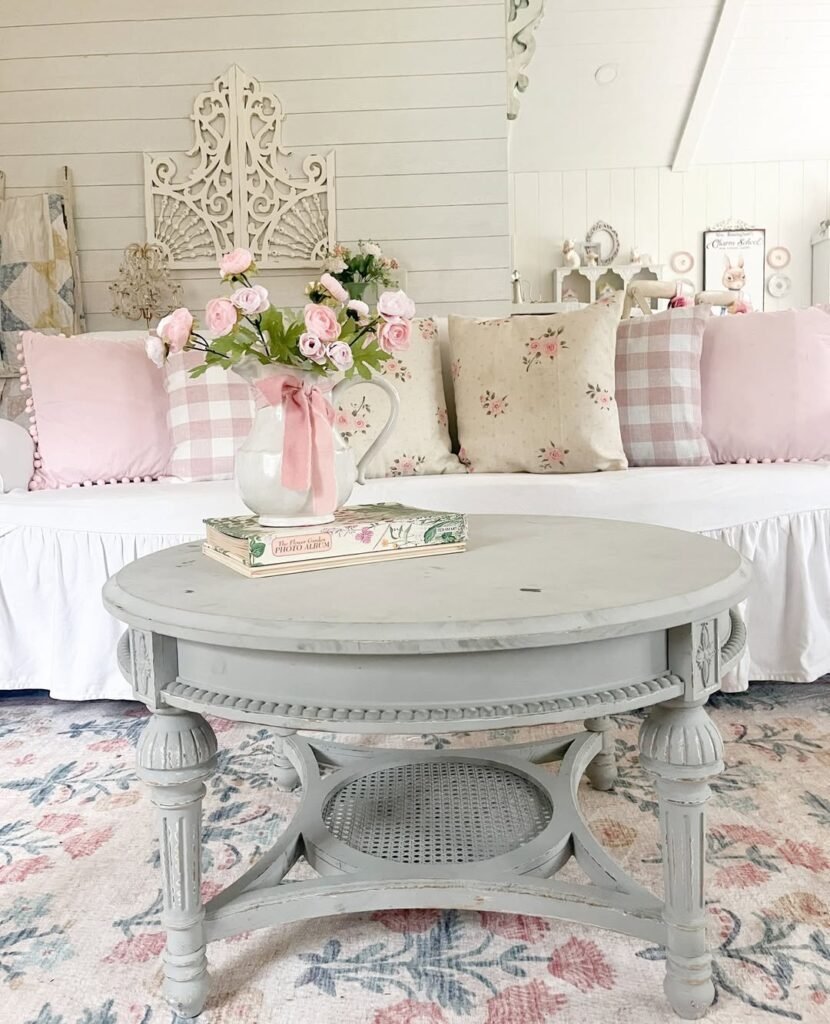
Achieving that perfect “shabby chic” vibe without your home merely looking old and cluttered is tougher than it appears.
Honestly, I love the charm of distressed furniture like this round grey table, but it often feels tricky to style it in a way that feels elegant rather than just messy.
Round tables act like a spotlight, drawing attention right to the center, so the pressure is on to get it right without overfilling the surface.
You might believe you need expensive, genuine antiques to pull this off, but the secret lies in a “less is more” approach using items that evoke visual warmth and nostalgia.
- Rely on classic vessels: Using a simple ceramic pitcher instead of a traditional vase to hold blooms instantly adds a fresh, farmhouse quality that feels effortlessly upscale without the high cost of intricate floral arrangements.
- Hunt for specific book covers: Scouting secondhand shops for hardcover books with spines or covers that match your room’s palette—like these lovely floral green editions—creates a cohesive, intentional decorative pedestal.
- Embrace the imperfections: Highlighting the chippy, distressed finish of painted wood rather than trying to hide it is key, as that worn patina is exactly what gives a piece that coveted heirloom status.
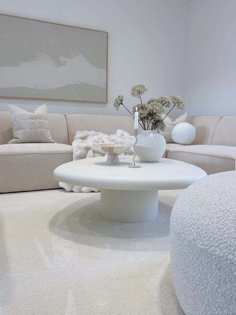
3. Mastering the Monochromatic Vibe
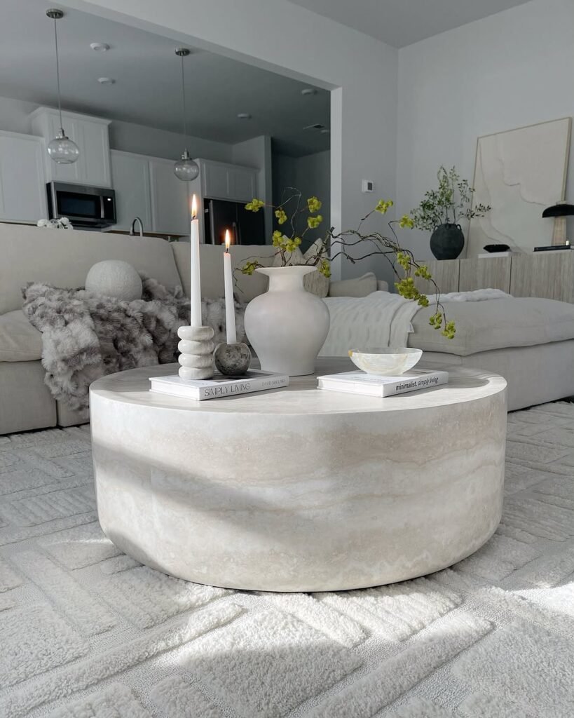
Neutral rooms often risk feeling sterile or cold, which makes styling a solid stone table feel like a high-stakes game. Admittedly,
I used to worry that a “beige on beige” palette would look flat and boring, lacking the cozy factor we all crave.
You might assume you need bold colors to create interest, but the truth is that layering varied textures creates a rich, expensive feel without a single pop of bright paint.
Heavy furniture pieces like this cylindrical table need lighter, airy accessories to prevent the space from feeling weighed down.
- Introduce living elements: Greenery is non-negotiable here. Displaying wild, sprawling branches in a matte vase brings an organic, untamed quality that prevents the heavy stone table from feeling too industrial or cold.
- Layer tonal textures: White doesn’t mean plain. Combining smooth candle wax with the rougher texture of a stone or ceramic vessel creates a subtle visual friction that makes the monochrome palette look intentional and high-end.
- Keep heights varied: Flat surfaces kill the vibe. Using tall tapers alongside low stacks of books, like the “Simply Living” volume seen here, guides the eye around the arrangement and adds architectural structure to the round table.
4. Sleek Bronze and Textured Modernity
Minimalist rooms with low furniture are notoriously hard to style because every single object feels like a massive statement.
Putting too much on a sleek, metallic table like this usually ends up looking messy rather than curated.
You probably worry that your space lacks warmth without piles of decor, but modern design actually demands breathing room. Expensive luxury here comes from the finish and placement, not the quantity of items.
- Group small items: Coralling tiny accessories like candle holders onto a matching dark tray prevents them from floating aimlessly on the large surface, giving the arrangement immediate structure.
- Contrast materials: Placing smooth, white ceramics against a bronzed or metallic table finish creates a necessary pop of brightness that keeps the moody aesthetic from feeling too heavy or somber.
- Respect the sightlines: Maintaining a low vertical profile for your centerpieces ensures the view out of those floor-to-ceiling windows remains unobstructed, preserving the open, airy flow of the room.
5. Geometric Wireframe and Mustard Pop
Wire-frame tables are fantastic for maintaining flow, but honestly, styling something that is barely there feels counterintuitive. I mean, you usually buy furniture to see it, right? You might worry that such a delicate black frame looks unfinished or cheap compared to a heavy wooden piece. Yet, the brilliance of this design is exactly how it disappears. It allows your bold choices—like that massive mustard sectional—to take center stage without visual competition.
- Echo the structural lines: Geometric harmony makes a room feel professionally designed. Mimicking the sharp, cubic shape of the black metal frame with square trays or angular books creates a satisfying repetition that feels intentional rather than accidental.
- Let the floor breathe: Overcrowding is the enemy of transparency. Leaving the majority of the glass top empty ensures the beautiful wood flooring remains visible, maintaining that airy, open concept vibe that makes the room feel larger.
- Balance the visual weight: Heavy sofas need a light counterpart. Pairing a chunky, plush sectional with such a slender, architectural table creates a dynamic contrast, proving you don’t need a bulky centerpiece to anchor a large seating area.
6. Warm Terracotta and Woven Boho
Tiny coffee tables are undeniably cute, but they are also a logistical nightmare when you actually want to put a drink down.
Where does the decor go if the surface area is barely two feet wide? You probably worry that a small, wire-base table looks cheap compared to heavy furniture, but the trick is leaning into that airy, casual aesthetic.
Curating a vignette with earthy materials makes the whole setup feel intentional and cozy rather than just temporary.
- Swap fresh for dried: Fresh flowers are expensive to maintain, whereas dried naturals like the wheat or lagurus grass seen here add instant, everlasting texture that perfectly complements the macrame lighting without costing a penny in upkeep.
- Stick to a warm palette: Mixing too many colors on a small table creates visual noise. Using ceramics in shades of cream and clay ensures the table accessories blend seamlessly with the surrounding woven wall decor and wood tones.
- Cluster, don’t scatter: Spreading items out makes a small table look messy. Grouping your candle, vase, and small figurines tightly together—perhaps on a book—creates a singular focal point that leaves the rest of the wood grain visible and functional.
7. Infusing Pop Art into Classic Architecture
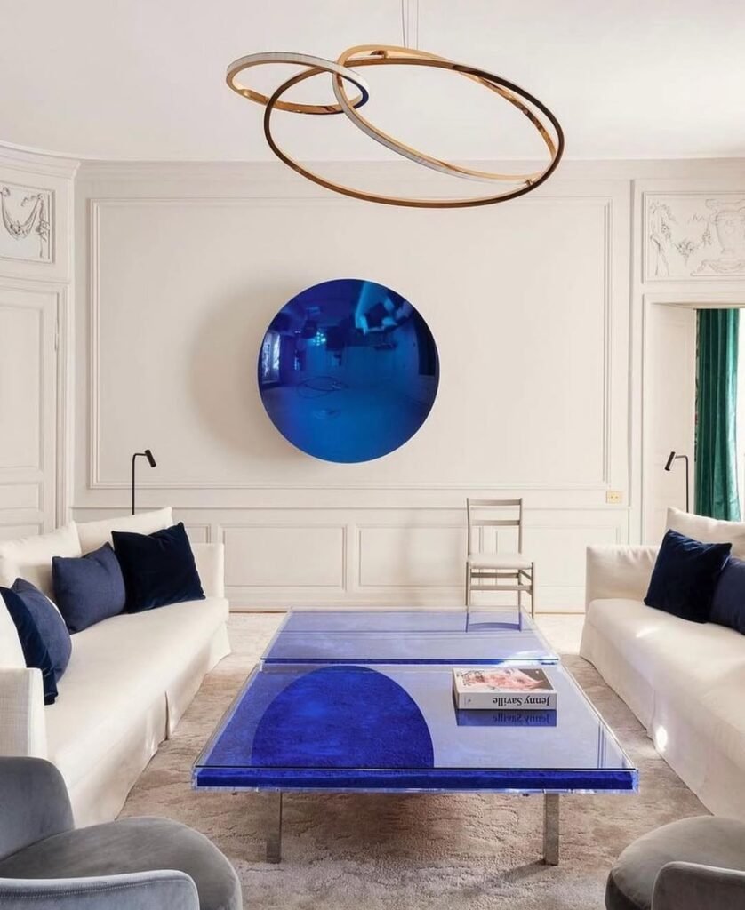
Mixing ultra-modern furniture with traditional architecture feels risky, honestly, almost like wearing sneakers with a tuxedo.
I often hesitate to introduce loud colors into a serene, white space for fear of ruining the calm vibe or making it look cheap.
You might worry that a neon-bright table looks tacky against elegant wall moldings, but bold contrasts actually create a high-end, gallery-like atmosphere. Confidence is the only real currency needed here, not a big budget for renovation.
- Commit to one bold shade: Color blocking creates impact. Matching the vibrant indigo of the table surface directly to the circular wall art ties the room together, making the furniture feel like a commissioned art piece rather than a random purchase.
- Let the surface speak: Clutter ruins transparency. Placing just a single, large art book—like the Jenny Saville volume here—preserves the reflective quality of the blue glass and prevents the bold color from becoming overwhelming.
- Balance with symmetry: Chaos needs order. Flanking the loud, modern table with identical white sofas and matching black reading lamps provides a quiet, structured backdrop that allows the blue centerpiece to shine without fighting for attention.
8. Softening the Modern Edge
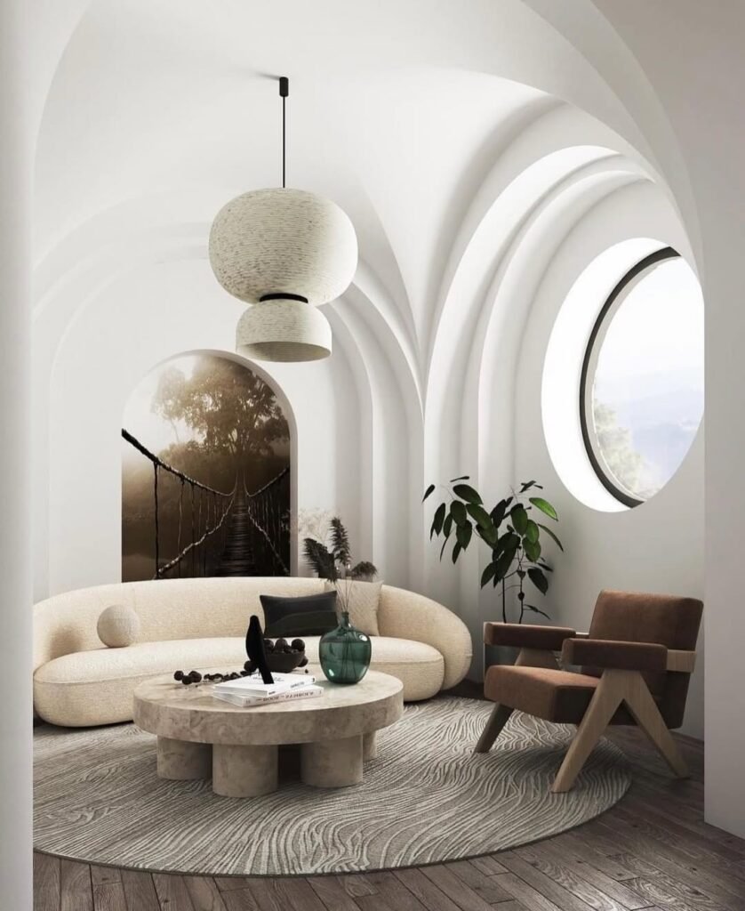
Round, chunky tables are trending hard, but honestly, they can feel incredibly heavy in a room full of curves.
I often look at stone furniture like this travertine piece and worry it will feel too cold or museum-like, almost as if you can’t actually touch anything.
You need a professional stylist to balance all these arches and circles without the space looking like a geometry class gone wrong, but the trick is actually grounding that pale stone with deep, moody accents to create warmth.
- Introduce deep transparency: Clear glass is fine, but adding a translucent, deep green vessel brings a moody richness that solid stone desperately needs to feel less like a slab of rock and more like a home.
- Punctuate with silhouette: Cream tones can wash out easily if left alone. Positioning a stark black sculptural object—like the bird silhouette seen here—provides a necessary visual anchor that stops the eye from sliding right off the smooth table surface.
- Mimic the footprint: Square rugs often fight with curved furniture. Placing the circular stone piece on a matching round rug with wavy textures creates a dedicated island of style that feels harmonious and custom-designed rather than mismatched.
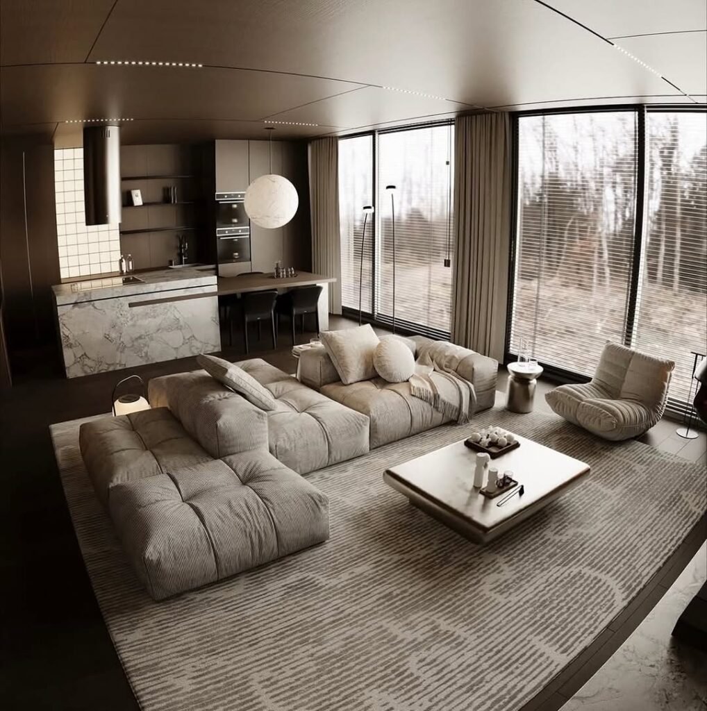
9. Mastering the Low-Slung Aesthetic
Concrete ceilings and bare walls often feel incredibly cold, honestly, it’s a struggle to make them feel inviting without covering every inch in fabric.
I often look at low, irregular tables like this matte black one and wonder if they are just too close to the ground to be practical styling surfaces.
You might assume you need to fill the vertical space with tall vases to compensate for the low furniture profile, but keeping the styling grounded actually emphasizes the cool, lounge-like atmosphere intended by the architecture.
- Respect the negative space: Clutter destroys the sleek silhouette of an organic table shape. Placing just three distinct items—a wooden bowl, a tiny vase, and a book—creates a triad that feels complete without hiding the table’s unique form.
- Warm up the matte finish: Black surfaces can look stark against a grey rug. Adding a natural wood vessel that mimics the tone of the lounge chairs brings a necessary touch of organic warmth that ties the floating furniture pieces together.
- Keep the sightlines low: Tall decor would fight with the massive wall art behind the sofa. Using low-profile accessories ensures that the oversized canvas remains the undisputed hero of the room, allowing the eye to travel seamlessly from the rug to the ceiling.
10. Heavy Marble and Rainbow Library
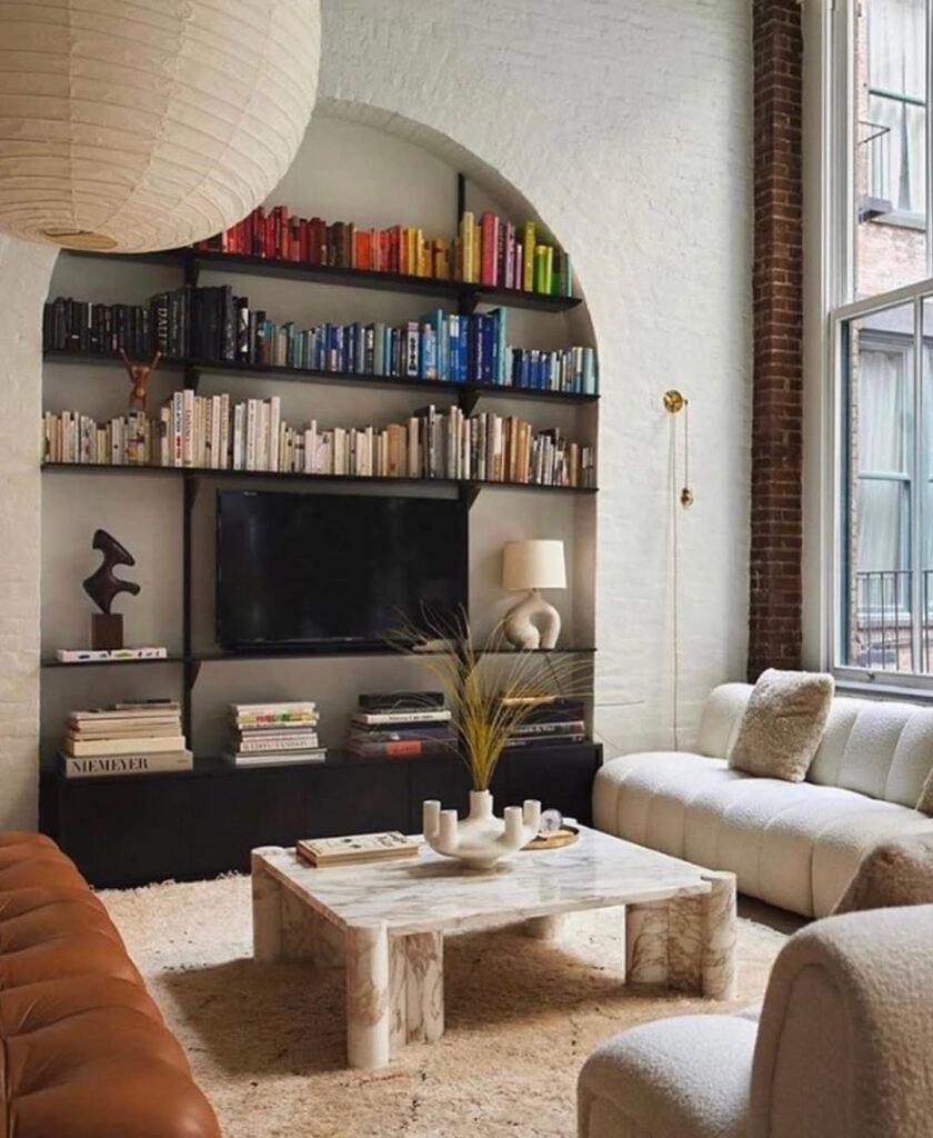
Open shelving packed with color—like this stunning rainbow arrangement—can easily turn a living room into a visual chaotic mess if you aren’t careful.
Honestly, I often struggle with balancing a “loud” background with a coffee table that needs to hold its own without adding to the noise.
You might feel the urge to keep the table completely bare to avoid clutter, but a heavy stone piece like this actually needs a few bold accessories to ground the space.
Expensive design in an eclectic room is all about knowing when to let the architecture speak and when to whisper.
- Curate with curves: Sharp corners need softening. Using a wavy, organic candle holder in the center mimics the beautiful arch of the built-in shelves, creating a subtle link between the furniture and the room’s structure.
- Keep literature low: Tall stacks would look messy here. Laying just one or two art books flat ensures the view of the TV and that incredible book collection remains unobstructed, keeping the vibe relaxed rather than studious.
- Mix heavy with soft: Stone requires warmth to feel inviting. Pairing the cold, hard surface of the marble table with a high-pile, shaggy rug softens the look instantly, making the heavy furniture feel luxurious rather than imposing.
11. Earthy Wabi-Sabi and Rust Accents
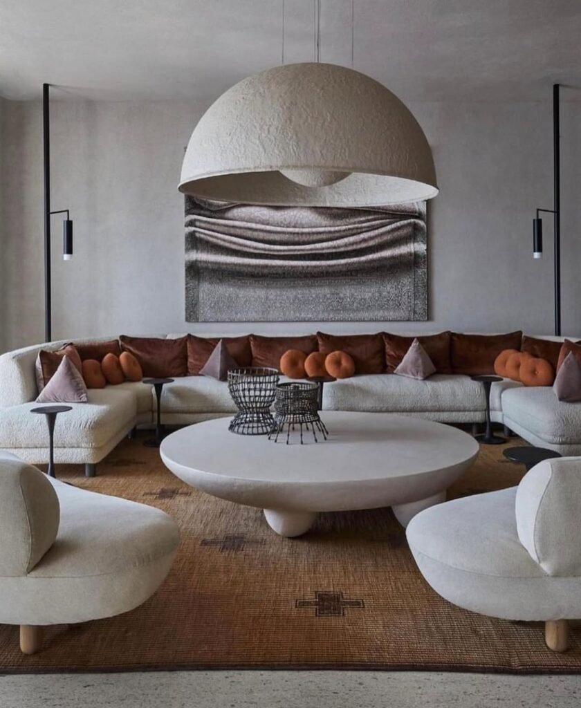
Massive, low-profile furniture pieces often feel impossible to style without making the room look like a barren warehouse.
Looking at a surface area this vast, my first instinct is usually to cover it with trays and books just to hide the empty space.
You might worry that leaving a giant stone circle mostly bare looks unfinished or lazy, but in a space defined by huge curves and heavy textures, clutter is actually the enemy. Styling here isn’t about filling gaps; it is about respecting the silence of the room.
- Prioritize open structures: Solid objects would look like heavy boulders here. Utilizing open-weave wire vessels—like these black architectural baskets—adds necessary height and contrast without blocking the flow of that incredible curved sofa.
- Echo the earthy palette: Stark white needs grounding. Pulling the deep rust tones from the velvet throw pillows into the surrounding decor or rug details creates a warm, cohesive loop that prevents the pale stone table from feeling too clinical or cold.
- Balance mass with void: Giant furniture demands breathing room. Resisting the urge to fill the center and instead placing sculptural items slightly off-center celebrates the table’s massive scale rather than trying to disguise it.
12. Styling the Nested Duo
Nested coffee tables are a brilliant hack for flexible entertaining, but honestly, styling two surfaces instead of one often feels like double the trouble.
I often stare at tiered sets like this and worry that putting decor on both levels will just look like a cluttered mess rather than a chic arrangement.
You might assume you need to fill every inch of that gorgeous marble top to make it look finished, but the real trick to looking expensive is holding back. Letting the metallic sheen and stone texture take the lead allows the furniture itself to act as the art piece.
- Embrace asymmetry: Uniformity looks rigid. Placing a tall, delicate arrangement of dried botanicals on the upper tier while keeping the lower table mostly bare creates a visual hierarchy that feels dynamic and professionally curated.
- Coordinate metals: Disjointed finishes cheapen a look. Ensuring the bronze or gold tones of the table base match the overhead lighting fixture ties the vertical space together, making the entire room feel like a cohesive, high-end suite.
- Soften the geometry: Linear walls need curves. Using the round shape of the tables to break up the sharp, angular lines of the textured wall paneling adds a necessary softness that keeps the modern design from feeling too aggressive or cold.
13. Raw Timber and Beige Serenity
Solid wood tables provide incredible warmth, but honestly, a piece this substantial can sometimes feel like a literal tree stump sitting in your lounge if you aren’t careful.
It’s a lot of brown visual weight to manage. You might worry that such a chunky, rustic surface will drag down the airy vibe of a modern room, but the secret is treating the wood as a foundation rather than a feature to be covered up.
Minimal styling here prevents the beautiful grain from getting lost in clutter, proving that expensive taste is often about what you don’t display.
- Define the landing zone: Scattering items across a large round surface creates chaos. Using a shallow, dark tray to corral smaller ceramics provides a necessary boundary, ensuring the arrangement feels tidy and deliberate rather than accidental.
- Add dark punctuation: Beige on brown often looks washed out. Introducing stark black or charcoal accessories—like the small bowls seen here—creates a sharp visual punch that breaks up the neutral palette and makes the natural wood tone pop.
- Maintain the horizontal flow: Tall vases would ruin the vibe. Sticking to low-profile items like flat books and small spherical sculptures respects the low-slung nature of the furniture, keeping the room feeling expansive and unobstructed.
14. Raw Slate and Zen Minimalism
Incorporating raw, natural elements like these stone slabs often feels intimidating because they look so rugged against soft interiors. Honestly,
I sometimes worry that using “outdoor” materials inside will look like I ran out of furniture budget and just dragged rocks in from the garden.
You might feel the intense pressure to soften them with trays or candles, but their beauty actually lies in their stark, untouched nature.
Allowing the texture of the stone to stand alone creates a gallery-like atmosphere that money simply can’t buy.
- Resist the urge to decorate: Leaving the surface completely bare—as seen with these slate pieces—forces the eye to appreciate the jagged edges and natural clefts, treating the furniture itself as a sculpture rather than a storage surface.
- Surround with extreme softness: Pairing the hard, cold stone with plush, woven chairs and sheer floor-to-ceiling curtains creates a tactile conflict that elevates the room, making the raw material feel deliberate and sophisticated.
- Balance the low profile from above: Introducing high-reaching greenery, like the hanging branch installation here, draws the gaze upward and counteracts the visual weight of the heavy stones on the floor, keeping the room feeling light.
15. Smoked Glass and Soft Curves
Minimalist spaces often teeter on the edge of feeling empty rather than curated. Honestly, styling a transparent, dark glass table like this feels high-stakes because there is absolutely nowhere to hide a coaster or a stray remote.
You probably worry that a see-through surface lacks the visual weight to anchor a room full of plush, cream furniture, but the goal here is “quiet luxury” where the floor plan feels uninterrupted.
Expensive style in this context is about preserving the open lines of sight rather than filling them up.
- Limit the layers: Overloading a glass surface defeats the purpose of its transparency. Placing just two neat stacks of magazines or books keeps the look intentional and allows the light to filter through the amber-toned legs without obstruction.
- Play with reflection: Dark glass acts like a mirror. Positioning the table near a large window captures the city light and sky, adding a dynamic, ever-changing layer of pattern to the surface that costs absolutely nothing.
- Echo the silhouette: Sharp angles would look harsh here. Choosing a table with curved, cylindrical bases perfectly mimics the rounded edges of the sofa and ottomans, creating a soft, continuous flow that feels incredibly expensive.
16. Balancing Weight in a Transitional Living Room
Dark furniture usually feels incredibly dominant, I mean, it acts like a visual anchor that refuses to move.
Honestly, I often hesitate to put a black table on a dark rug because I worry the details will just vanish into the shadows.
You might assume you need to flood the surface with white decor to make it visible, but choosing subtle, tonal accessories actually looks far more high-end and curated.
- Levitate the decor: Stacking light-colored hardcover books acts as a platform, physically lifting your smaller accessories—like that small stone bowl—off the dark surface so they don’t get lost in the void.
- Match the visual weight: Dainty furniture would look weak next to those chunky table legs. Flanking the piece with substantial, textured white armchairs provides a counterbalance that holds its own against the heavy wood.
- Embrace the mood: Bright flowers would look out of place. Opting for dried, desaturated hydrangeas in a rustic pot complements the vintage, moody atmosphere, proving that dead florals can actually bring a space to life.
17. Layering for a Cozy Cottage Feel
Neutral living rooms are incredibly calming, but honestly, without the right textures, they can easily slip into looking bland or “builder-grade.”
I often struggle with light wood furniture because it sometimes lacks the drama of darker pieces, making it hard to create a focal point.
You might worry that piling more beige onto a beige table creates a washout effect, but the secret to an expensive look here is actually layering varied materials in the same color family to build depth without color.
- Corral with natural fibers: Loose items feel messy on a wide surface. Placing a large, woven tray in the center anchors the glass vase and wooden accents, giving the arrangement a defined boundary that feels organized and purposeful.
- Utilize the second tier: Lower shelves often become dumping grounds for junk. Storing a matching wicker basket and a flat-lay book underneath keeps the visual weight balanced and hides clutter while maintaining the aesthetic.
- Bridge the gap with pattern: Solid wood needs a partner. Echoing the checkered pattern of the throw pillows with the texture of the wooden chain link on the table creates a subtle design dialogue that ties the furniture to the soft goods.
18. Plaster Pedestal and Dried Florals
All-white interiors are the ultimate dream for calmness, but honestly, they often risk feeling like a sterile hospital waiting room rather than a cozy home. I used to shy away from “white on white” styling because
I worried it would look flat or that I’d be terrified to even set a coffee cup down. You might think you need a pop of bright color to wake the space up, but the real secret to expensive minimalism is layering subtle variances in tone and texture.
A smooth, sculptural table like this needs tactile companions to feel inviting rather than untouchable.
- Play with organic height: Flatness is the enemy of interest. Using a large, round vessel filled with tall dried botanicals draws the eye upward and adds a natural, airy volume that prevents the heavy pedestal table from feeling like a solid block of concrete.
- Introduce sculptural whimsy: Serious furniture needs a lighthearted touch. Adding a curvy, wavy candle holder breaks up the perfect symmetry of the round table and artwork, injecting a bit of modern personality that feels collected and artful.
- Contrast the touch: Smooth surfaces crave rougher textures. Pairing the sleek, matte finish of the plaster table with the nubby, boucle fabric of the ottoman and pillows creates a sensory experience that makes the room feel warm and soft despite the lack of color.
19. Matte Black and Soft Cream
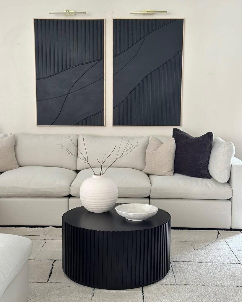
and vinchy_art
Black furniture often feels incredibly heavy, honestly, almost like it creates a visual void in the center of a light, airy room.
I often hesitate to use solid dark pieces because I worry they will overpower the softness of a neutral sofa and make the space feel too masculine or harsh.
You might assume you need bright colors to counteract the darkness, but the secret to an expensive, cohesive look is actually embracing the high contrast.
Pairing a substantial black drum table with stark white accessories creates a bold, graphic statement that feels intentional and gallery-worthy rather than gloomy.
- Create a textured dialogue: Flat black can look cheap. Choosing a table with ribbed or fluted detailing creates a direct visual link to the textured lines in the wall art, ensuring the dark elements feel connected rather than random.
- Pop with stark opposites: Dark surfaces swallow dark decor. Placing a bright, textured white vase and bowl directly on the black table creates a stunning separation that forces the eye to notice the beautiful curves of the accessories.
- Add airy height: Solid drums need visual lift. Filling the vase with tall, thin branches adds necessary verticality that breaks up the heaviness of the furniture without blocking the view of the incredible art behind it.
20. Marble Duo and Rustic Woods
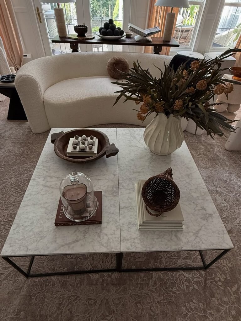
Pushing two coffee tables together is a genius move for flexibility, but honestly, styling across that center crack can feel awkward.
I mean, do you treat it as one giant table or two separate islands? You might worry that the setup looks temporary or mismatched, yet the key is creating a balanced grid that ignores the gap entirely.
Unified styling here transforms two affordable tables into one luxurious statement piece.
- Bring the outdoors in: Dried botanicals are essential for height. Filling a large, ribbed vase with sprawling dried eucalyptus branches adds a sculptural element that softens the hard lines of the marble without requiring constant water changes.
- Warm up the stone: Marble can feel clinically cold. Contrasting the sleek white surface with rustic wooden dough bowls and woven baskets injects a necessary dose of organic warmth that makes the space feel lived-in and cozy.
- Layer transparent shine: Solid objects can feel heavy. Stacking a glass cloche over a candle on top of books, like “Call It Home,” adds a reflective, airy quality that protects the wick while adding a bit of vintage charm.
21. Organic White and Brass Minimal
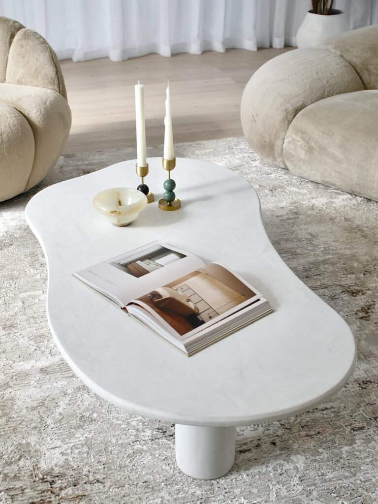
Irregular, organic tables are trendy, but honestly, styling them is a geometric puzzle because square trays just don’t fit. I often find myself pushing decor around these curves, worried that the asymmetry makes everything look off-center.
You might assume you need custom decor to match the weird shape, but the secret is actually keeping it sparse.
The silhouette of the table is the decoration, so you only need a few high-quality accents to make it sing.
- Add vertical rhythm: Flat tables feel one-dimensional. Using slim, brass candle holders with varying heights creates a heartbeat for the arrangement, drawing the eye up without blocking the flow of conversation.
- Invite interaction: Closed books can feel stiff. Leaving a favorite volume open suggests that the room is actually used for reading and relaxing, adding a layer of casual intimacy that money can’t buy.
- Contrast the finish: Matte plaster needs a shiny friend. Placing a polished stone or onyx bowl nearby introduces a necessary glint of texture that prevents the all-white setup from looking like a plaster cast.